A chat button for your website that visitors actually want to click
Asyntai drops a customizable launcher button onto any site — your brand color, your icon, left or right corner, desktop or mobile rules — with an AI assistant behind it that already knows your pages. One script tag to install, 36 languages, live from minute one.
Put a chat button on your website in minutes
Drop in your URL and preview how a branded launcher button would behave on your actual site
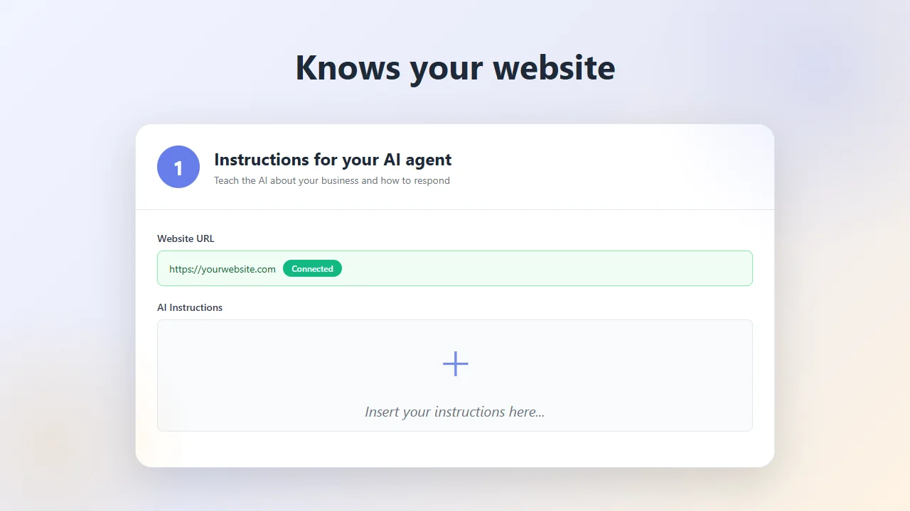
The button in the corner is the first impression — dial in exactly how it looks
Before a visitor ever opens a conversation, they see the launcher. Asyntai lets you shape every pixel of it: the circular button's fill color, its icon, the corner it sits in, the optional pulsing animation, even the small label text that can sit beside it on hover. Every change is previewed live in the dashboard so the finished button lines up with the rest of your site rather than clashing with it.
- Pick the fill color from your brand paletteDrop in any hex code and the launcher circle, its pulse, and the hover state all update together — no "chat-widget purple" forced on you.
- Choose the launcher iconSwap between a chat bubble, a question mark, a headset, a paper plane, or upload a custom icon that matches the visual language of the rest of your site.
- Left corner or right cornerPosition the button where it won't collide with your own floating CTAs, cart buttons, or cookie banners. Flip it per site if you run multiple installs.
Rules for when the button sits quietly and when it speaks up first
A good chat button isn't only about how it looks — it's about when it moves. Asyntai controls the launcher's behavior separately for desktop and mobile: whether it nudges visitors with an auto-opened bubble after a delay, whether it stays tucked away on thin mobile screens, whether it pulses to draw the eye on a pricing page but holds still on a blog post. You decide the pressure.
- Auto-trigger timing you controlSet a delay before the button proactively invites the visitor into a chat — zero for immediate, thirty seconds for patience, never for a purely passive launcher.
- Desktop and mobile configured separatelyEncourage chat on desktop while keeping the button small and silent on phones, so you never hijack a visitor reading an article on the train.
- Always visible, always reachableThe launcher stays pinned as visitors scroll, survives long pages and single-page app route changes, and persists across sessions so a returning visitor finds it exactly where they left it.
Add the chat button to your website with one script tag
The Asyntai launcher is delivered through a single async script. Drop the tag in your <head> and the button renders itself on every page — no theme hacks, no component library imports, nothing to wire up.
- Create a free Asyntai account and grab the snippet assigned to your site ID.
- Paste the snippet into your site's header — through a CMS header field, a script manager, or straight into the template file.
- Open the dashboard, set the button color, pick the icon, choose the corner, and decide how it should behave on phones.
- Crawl your site so the AI behind the button has answers ready, then flip the button live.
<script src="https://asyntai.com/widget.js"
data-id="your-site-id" async>
</script>
</head>
# Launcher button appears in the corner of every page.
Chat button for website — FAQs
Questions teams usually work through before adding a launcher button to a live site.
Can the button really match my brand color, or is there a preset palette?
You pick the exact hex value. The launcher circle, hover glow, and message-bubble accents inside the chat window all derive from that single color, so a deep forest green, an off-white cream, or a custom orange all work cleanly. There's no preset palette we force on you.
Can I replace the icon on the button with something custom?
Yes. Asyntai ships a handful of built-in options — chat bubble, question mark, headset, paper plane — and also accepts an uploaded image or SVG as the launcher icon. The custom icon scales cleanly on high-density displays and inherits the button's size rules.
What happens on a phone — does the button take over the screen?
No. The launcher stays as a small circular tap target in the corner on phones, and mobile-specific rules decide whether opening it fills the viewport or opens a shorter bubble-style pane. Both behaviors are configurable independently of the desktop experience so mobile visitors keep control of the page.
Is there a way to make the button open by itself for a new visitor?
Yes — an auto-trigger setting opens a greeting bubble after a delay you choose. Set it to zero for immediate, longer for patience, or turn it off entirely for a purely passive launcher. You can also limit auto-trigger to specific pages, so it speaks up on pricing pages but stays quiet during long-form reading.
Will the button clash with other floating elements on my site?
Because you pick the corner (left or right) and the offset adjusts to avoid overlap with typical cookie banners and floating CTAs, collisions are rare. If your site already has something in one corner, put the launcher in the other. Running a multi-site account means you can flip the corner per site without editing any code.
Does the launcher speak visitors' languages?
All the visible text around the button — the greeting bubble, the tooltip, the inside of the chat window — is localized into 36 languages, and the AI behind the button picks up each visitor's language from their first typed message. A Spanish visitor sees Spanish, a Korean visitor sees Korean, without a second install.
Can logged-in users see a different button than anonymous visitors?
The launcher itself is consistent, but the conversation behind it becomes personalized through the User Context feature on Standard and Pro plans. Your site pushes known user data into window.Asyntai.userContext before the script loads, and the AI uses that context for account-aware answers once the visitor taps the button.
What does adding the chat button cost?
Free plan covers 100 messages per month on a single site — enough for a small launcher pilot. Paid plans begin at $39 per month for 2,500 messages with two-site support, scaling up from there. Multi-site allowances are 1, 2, 3, and 20 sites across Free, Starter, Standard, and Pro, so agencies can run different branded buttons for different clients under one account.
The chat button as a piece of UI — getting the launcher right on your website
Most of the public conversation about website chat has been about what happens after a visitor clicks — the AI, the flows, the transcripts, the leads. Very little of it is about the thing a visitor actually sees first: the small circular button pinned to a corner of the page. And yet for anyone browsing a site, the launcher is the entire experience until they decide to engage with it. A well-shaped chat button signals that the site has a service layer and that someone has thought carefully about how it integrates with the rest of the design. A chat button that feels wedged in — wrong color, clumsy icon, bouncing when it shouldn't — undoes a lot of the trust the rest of the page works to build. Deciding to add a chat button to your website is therefore partly a decision about the AI that lives behind it, but just as much a decision about a piece of visible UI that will sit on every page from that day onward.
The first thing worth getting right is color. A generic purple launcher that matches no other element on your page doesn't just look off — it subtly tells visitors that the chat is a bolt-on, run by a different team, speaking a different design language than the site around it. The fix is trivial when the tool allows it: set the launcher's fill color to match your primary brand hue, let the hover state and the message bubbles inside the chat inherit from that same value, and suddenly the button looks like it was always part of the page. Asyntai's dashboard exposes a hex field rather than a palette of preapproved colors, so if your brand is coral, midnight blue, sage green, or a custom lavender, the launcher becomes that color exactly. The dashboard renders a live preview of the button next to a mock site, so the decision is visible before it ever ships.
After color, the icon inside the circle carries almost as much signal. The default chat-bubble glyph is universally readable, which is why so many widgets use it, but it's also the single most generic choice available. A question mark reads as "support" more than "chat" and suits helpdesk-style sites. A headset icon reads as "human reachable" and suits service businesses where the goal is a phone-style interaction. A paper-plane icon reads as "send" and suits sites whose chat is mostly about routing messages. An uploaded custom SVG reads as "this is ours" and belongs on sites where the rest of the design system is deliberate enough that a generic icon would feel lazy. The right choice depends on the site, which is why Asyntai ships the common options built in and also allows a custom upload for teams that want the launcher to match an internal icon library.
Position is the next dial, and the trade-off is practical rather than aesthetic. Most sites host the launcher in the bottom-right corner by default because Western reading patterns place it at the end of the natural scan path. But bottom-right is also where many ecommerce sites put their floating cart indicator, where some SaaS sites place feedback widgets, and where cookie banners in the EU often live. A launcher that collides with any of those ends up either obscured, forcing visitors to dismiss multiple elements to reach it, or pushed into an awkward vertical offset that highlights the collision. The solution is to let the launcher move: bottom-left is often the uncluttered corner, and Asyntai handles that with a single dashboard switch rather than any code change. For multi-site operators running Asyntai across several properties, each site's launcher can sit in a different corner according to what's already there.
Animation is where launcher design gets opinionated. A pulsing button catches the eye and reliably lifts engagement on pricing, service, and product pages — the commercial-intent pages where a visitor on the fence might welcome an invitation. A pulsing button on a blog post or a documentation page, by contrast, turns into visual noise that pulls attention away from the reading the visitor came for. Asyntai handles this tension by letting the pulse animation be enabled or disabled, and by letting auto-trigger bubbles be restricted to pages you specify. The result is a launcher that behaves differently across the site even though it's configured once — active where activity helps, quiet where activity distracts.
Mobile deserves its own paragraph because the button's role changes fundamentally on a small screen. On desktop, the launcher occupies a corner of a large canvas and never competes meaningfully with the main content. On a phone, the same launcher is a much larger proportion of the visible viewport, and the chat window it opens can consume the entire screen if configured that way. For a visitor trying to read a product page, a return policy, or an article on the train, a full-screen chat takeover is an instant reason to leave. Asyntai handles mobile through a set of rules applied independently of the desktop configuration: the launcher itself can be smaller on phones, the auto-trigger delay can be longer or disabled, the chat window that opens can be a shorter bubble rather than a full-screen overlay. Most teams end up picking a more reserved mobile profile than their desktop profile, and conversion data generally supports that choice.
What happens when a visitor does click the button is of course where the AI matters. The button is only a door; whatever opens behind it carries the rest of the experience. Asyntai's assistant reads the pages of the site it's installed on — services, products, policies, blog posts, pricing — and combines that with anything the team uploads privately, like PDFs of internal pricing, SOPs, or onboarding docs. Custom instructions in plain English further shape how it answers. The result is an assistant that gives grounded, on-brand responses the moment a visitor engages with the launcher, rather than generic LLM output or a tedious decision tree. The pairing of a well-designed button with a well-trained AI is what makes the whole thing earn its real-estate in the corner.
Language handling is another quiet differentiator that shows up the moment an international visitor taps the launcher. The tooltip that appears on hover, the greeting bubble that shows when auto-trigger fires, the placeholder text inside the input field — all of it is localized into 36 languages. When a visitor types their first message, the AI detects the language and responds in kind. A French visitor's experience from the moment they see the button through the whole conversation is a French-language experience, without a separate install or a translation plugin. For content sites with international SEO reach, ecommerce brands shipping globally, or SaaS products with trial traffic from many countries, the launcher quietly does multilingual work that would otherwise require a staffing layer.
Personalization for signed-in users is where a passive launcher turns into something closer to a concierge. The User Context feature on Standard and Pro plans lets the site push known user details into a JavaScript object that the widget reads on load. Name, plan tier, subscription state, recent activity, admin role — whatever is safe and useful to share. The launcher itself looks the same to every visitor, but the conversation that opens behind it is aware of who they are: "welcome back, Maria — I see you're on Pro" rather than the generic greeting shown to anonymous visitors. For SaaS dashboards, account areas, and membership sites, this makes the button feel like an integrated part of the product rather than a third-party widget sitting on top.
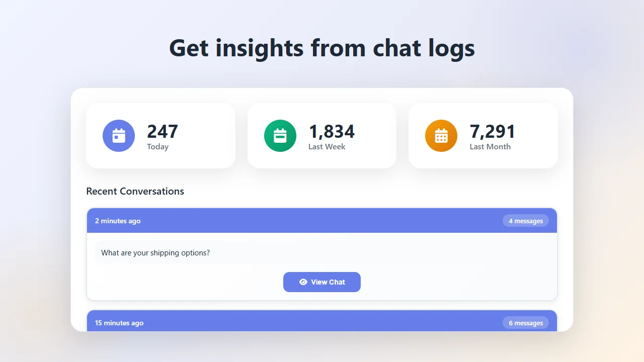
A launcher also quietly earns its keep as a lead-capture surface. Visitors who tap the button and discover the AI can't fully resolve their question aren't dead-ended — the widget collects their email and delivers the transcript to your Asyntai dashboard, with an optional copy sent to your team by email. That means every click on the launcher that doesn't get resolved in-chat still produces a documented conversation with a contactable lead, not a silent bounce. Over time, this turns the button from a service convenience into a measurable acquisition surface whose ROI you can track alongside form submissions and demo bookings.
Sizing a chat button to a specific business comes down to traffic volume and multi-site needs. The free plan gives one site and 100 monthly messages, which works for validating the launcher on a low-traffic landing page or a new side project. The paid tier starting at $39 per month covers 2,500 messages and two sites, which fits most small-business and mid-sized SaaS workloads comfortably. Higher tiers extend the monthly allowance and the site limit — three sites on Standard, ten on Pro — useful for portfolio operators, multi-brand retailers, and agencies installing the launcher for clients. Because pricing is per-conversation rather than per-agent, the curve stays friendly as visitor volume grows: a launcher handling thousands of visitors doesn't require a proportional team behind it.
The teams that get the most out of a well-designed chat button are the ones whose visitors tend to have questions answerable from the site itself — SaaS trial flows, ecommerce product and shipping questions, service-business qualification, membership-site access and procedure questions, content sites where readers get stuck looking for specific information. Wherever the site already has the answer somewhere, and the visitor just doesn't want to hunt for it, the launcher gives them a single-tap shortcut. And because Asyntai lets you tune the button's look, its position, its behavior per device, and its behavior per page, the same launcher can feel native to a minimalist SaaS dashboard, a maximalist Shopify store, a content-heavy university site, and a floating-CTA-covered landing page — because it's the same underlying script configured differently in each place.
Shipping a chat button onto a website is straightforward enough that the interesting work happens in the design decisions rather than the installation. Paste the script in the header. Open the dashboard. Pick the color, the icon, the corner. Decide whether to pulse. Tune mobile separately. Point the AI at the URL. Drop in the PDFs. Write a few sentences of plain-English instructions. Test half a dozen real-looking conversations. Flip the launcher live. The button is now pinned to every page of the site, branded the way the rest of the design is branded, answering the questions visitors used to bounce on, collecting the leads that used to evaporate. The piece of UI in the corner has quietly become one of the site's most useful elements.